STEP THREE: EDIT YOUR PHOTO
Part Three: Editing colored artwork in iPhoto
If you have iPhoto, it probably opens by default when you plug in a camera. Import your photos, and choose the best one. To get to "edit" mode, double click the picture you want to work on.
TIP! If you would like to practice by copying this step-by-step exactly, you can download my example picture here. Once you've downloaded it, use the iPhoto file menu to import the image.
Since we avoided using flash when we took a picture of the colored artwork, our picture isn't as bright as it could be. We're going to do our best to lighten the background without ruining the colors.
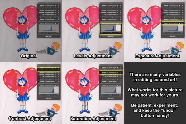
These steps worked for this image, but it took some trial-and-error to figure out what they were. Be patient when editing colored artwork! The more often you try it, the better you will get the hang of it.
We're going to start by adjusting the Levels. The Levels image (called a histogram) is a visual measure of the brightness and contrast in your image. (For a more detailed explanation of the iPhoto Levels adjuster, click here.)
You'll notice that the histogram for this colored picture looks different than the one for our earlier black and white picture—instead of the blue, green, and red "mountains" completely overlapping, they spike at different places. (Try moving each of the Adjust Box sliders back and forth and watch how the shape of the histogram changes.)
A good rule of thumb for dealing with Levels is to line up the righthand slider with the first (or rightmost) big spike of the histogram. (Think of this as a starting point, and then continue to adjust it until it looks right.) You can do this in one of two ways:
A: You can simply move the righthand Levels slider until it is aligned with the center of the rightmost (in this case red) spike.
B: You can move the righthand Levels slider towards the righthand spike, and then adjust the Exposure slider.
I found that this image looked best when using the second method, so that's what I did here.
Next: In order to darken the lines of the image (which I felt were too light), I increased the contrast. While this darkened the lines, it had the unwanted side effect of blowing out some of the shading/texture in the darker areas of the heart.
Since increasing the contrast of your image will make the colors more saturated, it will sometimes cause you to lose details. To get that detail back, you can lower the saturation slightly.
This is the tricky and wonderful thing about editing colored pictures—anything you change can (and will) affect another aspect of the image. Be patient, be adventurous, and keep tweaking until it looks good to you.
If it seems too daunting, don't worry. Even if you stop after the very first step, your picture will still look better than if you had done nothing at all!
Page One: Introduction.
Page Two: Prepare your artwork.
Page Three: Take the picture!
Page Four: Edit your lineart with iPhoto
Page Five: Edit your lineart with Picnik
Page Six: Edit your colored work with iPhoto (You are here!)
Page Seven: Edit your colored work with Picnik
Page Eight: Before and after!