The 4th placer is... we have a tie! Satina and WrongSpelling!
For Satina:
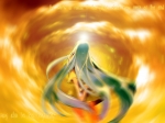
My comment: I like how you did with everything! It's a little too bright for me though.
That little bright thing seems to be lost. If you would ask me, I could visualize a girl that's being surrounded by flame.
The text also looks good! I like the effect. Though the font used doesn't fit too well.
EDIT: I just realized, if I imagine it like the girl is looking upwards, I can imagine the apocalypse. This is a very wonderful concept! The best I've seen so far! Wow. But sadly, my contest is not centered in concept but style. Sigh* but still, I LOVE THE CONCEPT!
Rating:
Difference in style----------- 17%
Creativity-------------------- 17%
Originality------------------- 17%
Beauty------------------------ 18%
Clearness--------------------- 27%
Total------------------------- 96%
Congratulations!
For WrongSpelling:
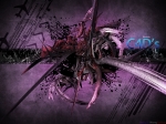
My comment: The C4d usage is good. The color combo is good too!
The brushes fit the "feel" of the wallpaper. The fonts you used for the text is also good.
Let me point out some things that needs a little improvement.
I can see that those bursting parts of the c4ds aren't really blending too well. But that's optional if you want to change it, because it's really unnoticeable. The only thing that's verrry noticeable is the color of the text "C4d's" It drags the attention of the eyes toward it instead of the focal (which is the c4d in this case)
But it's good though
Rating:
Difference in style-------------- 17%
Creativity----------------------- 18%
Originality---------------------- 19%
Beauty--------------------------- 17%
Clearness------------------------ 25%
Total---------------------------- 96%
Congratulations!