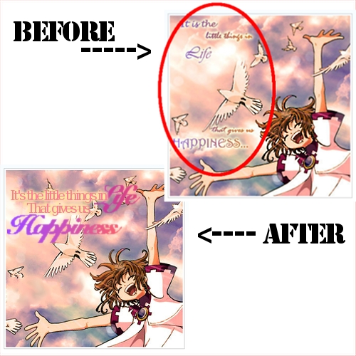
In the above picture, I took someone's e-card (with their permission). They had asked about how they could improve their e-cards and my next few posts will be on tips to improving them.
For this one, the scan is beautiful, and the color and typography of the words are great. The only thing? Try less spacing for the words. Put all the words together as shown in the bottom picture. This way, the person who receives the card can see the message without having to move the eyes too much. It's also easier to focus on the different parts of the picture.
Stay away from separating words that much. Keep them all together. It's best if you use them to form a sort of rectangle.
Quick overview:
[x] Don't space out the words on an e-card too much.
[x] Have the words form a sort of rectangle.