A hakuna without it’s Matata (VV article ):
Well going into the theme I will like to write about the new version of the Otaku Version Vibrant as we all know it (VV).I’m going to try to give a constructive criticism about all the positive negative sides of it hopefully you like it and you can comment about what u did like and what you don’t like of VV and the article.
Hakuna with no Matata (VV without myotaku):
I do remember and always thought about this site that TheOtaku and Myotaku were a so good accomplished combination . You had one backroom where you could see who updated. The links were fast and you could go to pm´s and see the signs of you guestbook all in one page. That was fast and very efficient and you could also post and modify your page in the backroom .You could move very easily from there to any part. I would have thought from that moment that VV would stick with that design and move Theotaku and Myotaku into modernity. Moving just the otaku to VV was probably the worst mistake for the new version making. Now the compatibility of the sites (it’s sites because they are not well bonded to be considered as one) is just horrible .You can’t go from VV to myotaku anymore and it’s so hard to use two backgrounds instead of one. I will like to give the advice that it will be a good idea to
move myotaku background inside Version Vibrant Background (making a new section beside messages) so we could have a big backroom were we could move easily from any part of Version Vibrant into myotaku .A link from Version Vibrant to my otaku is something we really need. Version Vibrant needs a better way to bond with otaku because that didn’t came well on this Version.
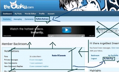
Version Vibrant Alone :
The positive sides about VV could go from the new Worlds Feature that is a very interesting new category to the good art searching it haves. I like the blue white colors
it gives a good sense of modernity and relaxing sensation. What I must tell about VV is that I don’t like in art daily submission section .The matters is I really don’t find the best arts of the day the fastest I did before and appreciating art is hard. I like the idea to turn the daily submission search into a wider selection of days weeks and month it gives move versatility in the search. I didn’t like the page size because I have to scroll down and sometimes left right to find things. The older format was better in that aspect because you only had to scroll down up. Also when you enter a portfolio section (Fan Art for example) you will have to scroll down and left right to see the art. In the old format you entered a portfolio Fan Art selection and you could see the pictures that second. And also you will see the number of votes and pictures submitted .Here on VV you don’t know any of that stuff .I also didn’t like that the comment box (the one with the number of comments you made info) now it’s gone. When you enter now a portfolio you will have to scroll down because the starting position is just full of publicity and little user information .I liked the direct Pm button you have beside the user’s name. But I don’t like all the misused space you have with a big box that should be smaller..And Il wish the page was better distributed so you could see the important things at the first view without scrolling. The hi there box should have a link to your page on myotaku or your myotaku backroom. We don’t like having two backgrounds that’s for sure.
Myotaku boards (A standing ovation ):
This I must say was the best part of the changes. What a nice design (very similar to the old glories of the otaku ) .It haves a theme change option were you can change the back ground (that’s originality great work).The options and the links move you very fast and are in the correct place .At first glance you will be ready to start reading articles (very different from VV that you always have to scroll down to see something interesting).You can get the user information by just clinking in his name. If you ask me this is how VV should have looked like .It’s modern and you can change the theme. You can move to the past articles very fast and exploring old ones is so easy. The best work I seen in the making of a site I love it. If you have a design that works don’t change it just upgrade it.
The leftovers of Myotaku(Where is my home?) :
Now going to the part that gives me so much pain , the part of Myotaku ,our home and place of expression for many years. I now find a background with no pms options (we want one backroom to see all, move that to VV ) and a low number of posts to be weekend .I don’t want to go to another page to check who posted and what did he posted. I will love to see in a unique background on Version Vibrant to see who posted were (myotaku or worlds) send pms go to Myotaku, visit an user etc .That is something we don’t have here and looks like Myotaku has be expelled for the site’s main view (a big mistake ).I don’t know if someone can picture this place without their myotaku page (a place I call home ).I think Version Vibrant needs to welcome back myotaku into the main Evolution project if we want to see this new project as a success. Now myotaku is an abandoned place .Not even the comment box in Myotaku works, it’s still bugged and doesn’t work properly. Also there is no link from other user’s portfolios to their myotaku sites . How am I supposed to sign guest books If I can’t visit their site. Seems myotaku is just a leftover to go to Version Vibrant and not back. It’s like if they moved my house to a different country and I have to travel miles to see my friends and the new pictures.
Good points resume:
Myotaku boards: (the legacy of theotaku great design ).Good design and great links to move. Also an option to change the theme.
Worlds : A new place to express and to search for friends.Searching for other´s articles is great.
VV Searching Section : The new way to look from the newest art and find old pictures.
New design: Nice colors and modern design on VV .
Bad points resume:
VV Myotaku bonding : It’s horrible there is no way to access myotaku from Version Vibrant and they are different sites .VV is taking many elements that were from myotaku so there is no balance is the sites. There are two backgrounds and people don’t like to check two places to know how are their friends .Move the myotaku backroom into VV and stop the separation and exclusion of myotaku.
Never change what works: If you have a great design like Myotaku boards keep the theme for the other sites. Don’t go into a new design that is different to what we like and might not work the same. Good designs can always have upgrades and get better. Bad designs are hard to upgrade.
Feature Section: Searching for the best art now is a real paint .I want to see an organized daily section so I can see the most commented picture ,the most hugged picture, the most favorite picture, and the newest picture.
Two backgrounds :That doesn’t work at all move myotaku Background inside VV.
Bugs: It’s been almost two weeks it’s time to call the exterminator.
Speed: Give us the promised speed to travel VV . It’s not use at all if we have a great speed if we don’t have at all links to travel and to travel fast.
No guestbook signs: How I am supposed to sing someone’s guestbook if I cant visit his myotaku page and the is no link to myotaku on his portfolio?
Please consider this article as my own point of view. There might be people that like Version Vibrant at it is .I would personally think most of the old users will agree with some of this things .Hopefully there wont be any offence in writing a good perspective and an article that just looked for constructive criticism.
Angel