I HEART THE OTAKU! IS NOW FINISHED!!!! :D
Here are the winners: (from third to first place)
I Love theOtaku by CloudBerry
Honestly, this one is pretty simple. Presentation is simple... More on typo and no anime images used just like what some people entered in the challenge. But what's good is that this is the cleanest among them all. Some of those plain entries have complicated texture design. Not that they're bad, but it makes the textures give life to the wallpaper instead of the typo. What Cloud did is the opposite. I give praise for her because of that. Just a cute font, a simple texture and a neat brushwork is enough for the presentation. Very clean yet it looks good at the same time.
Theotaku.com by Variance
variance just made the unexpected. I actually hoped that someone will make a web design interface as entry for the challenge. But I lost hope seeing the entries were all similar. But his entry made me smile and totally makes his entry unique for the challenge. I also like the fact that he went away from the usual blue color scheme of the site to a luxurious black one. Very elegant portfolio design!
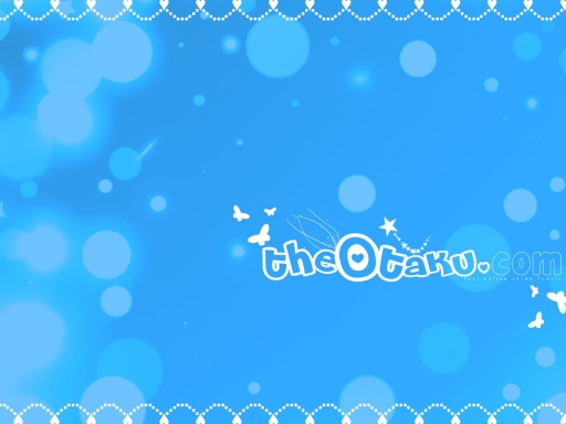
The <3 Otaku.com by Yamaro
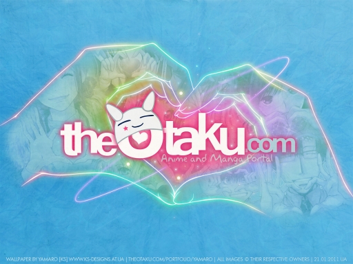
Just because he's my idol doesn't mean I'm letting Yamaro win in my challenge that easily. I'm not biased! You guys should take a look at this wallpaper before ranting... For me, Yamaro made the most efforts in this challenge. I like his idea of using images that has a heart-shape hand gestures and putting them all in a fantastic hand outline that is also making a heart-shape hand gesture. I appreciate his efforts for making the theO logo. He did not make a typo of his own, but he tried his best to find fonts that resembles the original one. To top it all off, the wallpaper is available in many resolutions and I believe 3840x2560 is the biggest. Its simple looking but its made with of effort and lots of love. Very deserving to win the 1st place.