Welcome to my third icon tutorial ever written (you can find the others here)! After experimenting with effects and textures, the end result reminded me a lot of the coloring of comics such as X-Men, so I decided to write about it. This time I'll be explaining how to make a simple black & white manga image look as if it were cropped out of a comic book.
The tutorial is written for Photoshop CS2 since it's the one I have. All textures are provided (and their creators given credit) when mentioned, including the PSD template, at the end of the tutorial :]
First, the image, from the manhwa A Cat That Loved A Fish. I picked this page, more specifically the bottom panel. I opened it in PS and cropped it to 100x100, then unlocked the background layer by double-clicking it. After this, I renamed it to "image" and set its blending mode to Multiply. This is to ensure only the black part will remain and the white will be amost non-existent, since it's the white part we're coloring in; all coloring is done under the "image" layer.
1. Cleaning
Fortunately, this image was clean to begin with, but you may encounter images with a lot of artifacts so learning how to clean is important. It is best to do this by selecting one of the default round brushes that come with PS for your eraser (click for settings).
Recommended settings: Master Diameter: 3-5 px, Hardness: 100%, Opacity: 100%. Since you're working with such a small image, you'll probably need to zoom up to 600% for precision.
Here is my image, after removing all the shading (on the girl's skin and clothes).
![]()
2. Coloring
Grab a brush (preferably with the same settings as the eraser) and simply start filling in the white spaces, like you did with those coloring books when you were a kid.
What I did, shown below: skin base --- skin base+shade ---jacket base --- jacket shade --- hair.
![]()
![]()
![]()
![]()
![]()
Skin base: this is entirely up to you, pick whatever skintone you'd like for your character.
Skin shade*: I highly recommend you make a separate layer for advanced shading, since it's easier to erase parts you're not satsfied with, and you can change hues, lighting and others by playing with the blending mode. In this case, the shade I picked was too strong, so I ended up desaturating it a bit (Image -> Adjustments -> Hue/Saturation... or Ctrl+U) and setting the layer's blending mode to Multiply. Now, I can't teach you how the shading goes, it depends on every image; you'll have to find the light source and figure out how shadows would fall.
Jacket and jacket shade: same as with skin base and shade.
Hair: I only used one color because if I added shades they wouldn't be visible anyway.
Needless to say, all these layers go under "image".
* Tip: if you aren't sure how to add skin shading, use the Eyedropper Tool to select the color you used as your skin base, for your foreground color (if it wasn't already selected). Then, click on the background color and then on the foreground color**. Pick your shade by clicking somewhere bottom-diagonally, like this: click for demonstration.
** Why am I telling you to do this? It's better to have both shades at had so as not to hunt down one of them every time you need it.
3. Effects
What follows is written according to the previews below.
First image: I started by adding a red tint, just to make it look a bit warmer. Make a new layer and fill it with the color #da1212, blending mode Overlay, Fill 40%. This layer goes above the "image" one since we're focusing on the lineart now.
Second image: Make a new layer, "gradient", and place it below "image". Fill it with a gradient with these details: linear gradient (first type); colors: #5883b7 (left), #8ab6d2 (middle), #a6c6dd (right); layer blending mode: Lighten, Fill 50%. On the image, the lighter part of the gradient should be on the top part.
Third image: you will need to download this texture (credit: mortgraphics. Paste it below "gradient"; blending mode Color Burn.
Fourth image: I duplicated the "hair" layer two times and set both duplicate layers' blending modes to Screen, to make the hair more visible.
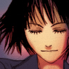
Fifth image: download this texture (credit: jordannamorgan) and paste it on top of all the layers. Blending mode: Multiply, Fill 40%. With a soft eraser (Master Diameter around 37px, 0% Hardness, 30% Opacity), erase the area that covers the face. And voila, here you have your icon!~
![]()
![]()
![]()
![]()
Hope you found this tutorial helpful, and don't hesitate to show off your results or ask questions :D
Edit: Oops, sorry about that! I forgot to include the template! Get it here.