External Image

In its early days, this World used to be all about smart discussions and posts and stuff like that. But since I hardly write articles now because of the lack of time, this World is now a place dedicated to showcasing whatever I do that doesn't relate to blogging about my life (which is already covered in this World). So, in a nutshell, this place is for graphics and resources.

Browse (most of) my stuff here by tags:

I take icon requests, so PM me or write me a comment :3 And feel free to use the stuff I make: you don't need to credit me if you use icons, but I'd appreciate some credit for the rest.

Looking for moar shiny?
Rai's iCons n'@ | Dollie's Delightful Graphics | BabyD's Yenesis's Gallery | TimCanpy's Icon Island
Dark Flame 3479's Photostatic Icons | XkeyofdestinyX's Mix&Match | Anna's little things | Blue Latte's iHeart
Alexa's Anonymous Gallery | Kami's LOVE1000% | Klassic's Pink Sweetness | Akane's Flowery Garden
ItachiSasuke's [ICON]ic SymbolS
External Image

If you know of any other worlds with icons/graphics, drop me a line and I'll feature them~

Background pattern: made with Colour Lovers by me.
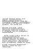
Icon resources: 10 puny text textures

External Image External Image External Image External Image External Image
External Image External Image External Image External Image

Used: here, here, here, here and here.
You get inverted variations because sometimes you just want to use white text instead of the usual black :3 I should say that they're not simply inverted (like the MS Paint kind of inversion), but manually switched to white-and-black.

Note: while they may look jagged here, the textures look good on icons (with a Multiply or Screen blending mode).

Enjoy and, as usual, please credit me if you use them.
Text used is from here (surprising, ain't it? 8D)

How to achieve this effect in Photoshop CS2
Font: PF Tempesta Seven Compressed (download it here)
Size: 2.8px
Letter spacing ("Character" pane, horizontal arrow thingy): 300
Row spacing ("Character" pane): 3px
Bold (optional, may be left simple)
Anti-aliasing: either None, Sharp or Strong (Sharp recommended)

Note: if you use a letter spacing of 400, use a Height of 70%.

Icons: Tengen Toppa Gurren Lagann [for Ritona Raito]

External Image External Image External Image External Image External Image
External Image External Image External Image External Image
1000 variations!

Hehe, it seems fit that after posting the prizes for your challenge, you get some prizes too :3 The card is still in the works, mainly because I've scrapped the previous idea after raiding the MT scan gallery and downloading roughly 1/3 of it.
There are so many variations because I couldn't decide which was better, so I ended up submitting all versions.

Icons: Phantom Of The Opera

External Image External Image External Image External Image External Image
External Image External Image External Image External Image
Variations over here!

Eeeeee there's a POTO category I've never noticed before <3 Spammed you with more icons because my monitor stopped going apeshit for a short period of time yesterday and I took advantage of this. Also, blame Hula for these icons, she posted two cards and got me in the mood.
Also, I love Carlotta, even though she's a bitch :3

EDIT: "screwa you alla!" is taken from here. Pure awesomeness. Seriously, I laughed my butt off on that blog 8D

Icons: Tangled [for Angel Zakuro]

External Image External Image External Image External Image External Image
External Image External Image External Image External Image
You know you want more.

Hurr I'm slow tonight since it's almost 12 a.m. and I've been through a lot.
My absolute fave is the first icon. I occasionally have bursts of creativity that even I don't know where they come from. I'll go now because I'm becoming more and more grammatically challenged by the minute.
Edit: no, Kels, these aren't your only prize.
Edit #2: if anyone else wants moar icons for their prize, poke me with a long stick :D
Edit #3: icon #78 is a nod to this. There is and "i" in "Shakesperian", it's too small to see well, maybe it's a good thing, since the spell checker's telling me it's written "Shakespearean". I'm illiterate 8D
Edit #4: credit for the amazing screencaps goes to je vue <33

Wallpaper: Black Swan [+3 variations]

As much as I wasn't impressed by the movie itself, I love the posters. They are what ultimately determined me to watch this, and while the movie didn't rise to my expectations, the posters are still kickass. I hope to make more walls from them....

Read the full post »